- | HOME |
- CONCEPTBOX |
- TIPS |
- GALLERY |
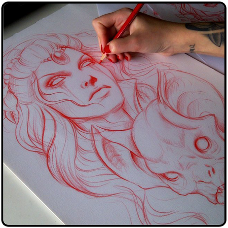
A good sketch or linework is a key to a good painting. The only way to get better at drawing is simply to PRACTICE. Be patient, and don't get fraustrated if you don't get a sketch right.
A good way to practice is to make drawing a hobby. Everyday,take time and draw atleast one sketch. It doesn't matter whether it is on a computer or a piece of paper. You can use a reference or draw from you're imagination if you want to, and you'll eventually get better.
|
|
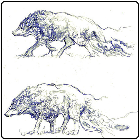
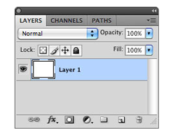
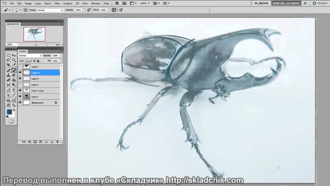
Don't think of Photoshop as a simple coloring book. In Photoshop, there are Layer, so use this to your advantage.
Now, you need to learn how to blend colors. To do this, use the brush tool's Opacity and Flow options to your advantage.
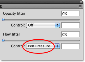
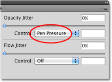
Select the first color, then press your stylus, from hard to soft, to create that blending effect. Do this again with the second color
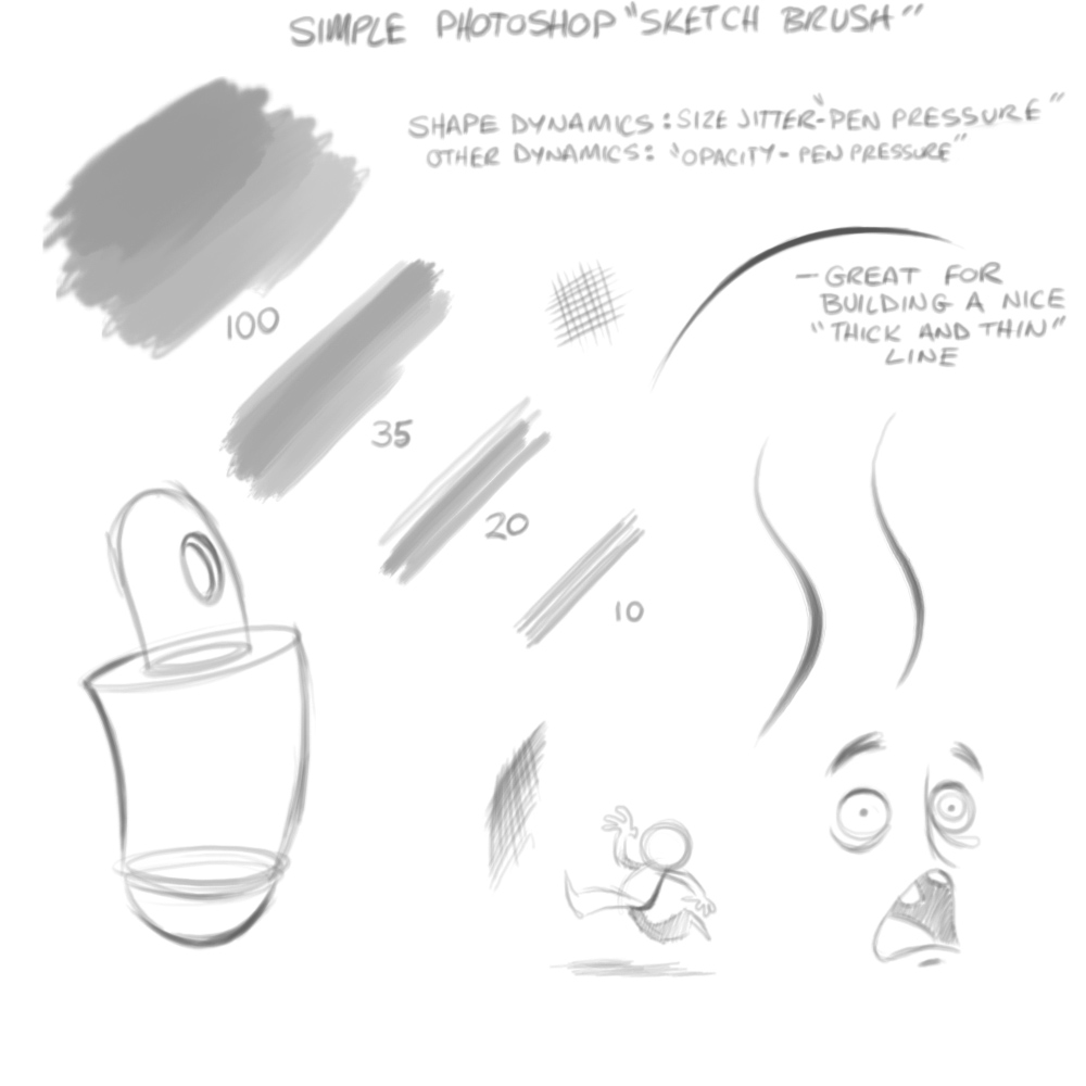
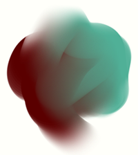
Combine this with Sketching and Layers, and with alot of practice, you'll soon be doing illustrations like this:
Choosing the right color combinations can help improve your Artworks. To most people, color combination really isn't a big issue, but they just don't realize. to me, color combination is alot of help.
I want you to be more familiarized with the color wheel.
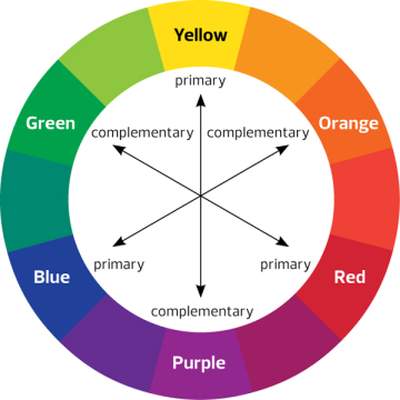
The first kind of color combination is the Complementary colors.
Notice that the color wheel above points out colors opposite of each other. Complementary colors are good combinations because the don't blend with each other well, so you can easily distinguish on form the other.
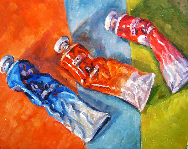
In the painting above, notice that the blue subject has a orange background, the orange has blue, and the red has green. See how the elements are so easy to be seen. Imagine if the orange subject has yellow for it's background? It wouldn't be pleasing to the eyes.
Another kind of Color combination is the Color traids.
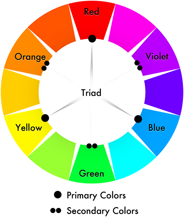
This time, notice how the colors now form a triangle. Same thing applies as Complementary colors. They'd look good together.
This time, we will be talking about composition and Focal point. Composition is the way you arrange the elements in your artwork. Here is a example:

I bet you first looked at the puppy, because it's like the only thing there is to look at. The artist used simplicity to quickly divert your attention at where he wants it to be, and this point is called the Focal point. Besides the number of elements you used, I'd also like to point out Contrast. Notice the background's dark blue color helps the focal point stand out.
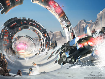
In this example ,there is the car ( or spacecraft... whatever), there is the Ring-like structures, and there are those other cars. These are elements. Notice how the rings guide your vision to the car. The rings are the focal point, but the subject isn't the ring, it actually the car. This is another way of controlling the vision of the viewer. The rings also tell us how big the cars is. This is called proportion.
Group members :
Carl Jayme --- Luis Evangelista --- Miguel Guanzon ---- Gian Gerangaya ---- Regie Delariarte
DISCLAIMER: None of the images or graphics I used in this site are mine. This site is only for project purposes only. Credits goes to their original owner.